It's not often that you see an application that simply blows you away. This video has been receiving well deserved praise in the yellow-verse during the last week. If you are not a member, of said yellow-verse, you might have missed it. Frankly, its well worth watching regardless of which is your preferred platform/language/religon/taste in beer yada, yada.
Nathan Freeman and Chris Blatnick have been presenting and actively evangalising 'impactful' interfaces. This new one, blows away what has been in their presentations thus far (which has been pretty good anyway). 'Bones' sets the bar well and truly high. The whole project, not just the UI, is pretty astounding. Peter Presnell has a good write up which is worth a read.
Nathan and the team at Lotus911 have worked out some of the trickier details in crafting the interface, kiosk mode and composite applications, but have been smart in choosing Lotus Notes & Domino for the ancillary parts of the project around security, encryption and network failure. They've also been smart in choosing the hardware specifically for the target environment.
Dare I say a smart choice for a smart planet.
The take-away for Lotus Notes developers, who don't develop kiosk applications all that often, is that with composite applications you can craft any user interface you or your users desire.
It may not be easy, but at least now we know it's possible.
Well done Lotus911, Nathan and the Team.
Showing posts with label UI. Show all posts
Showing posts with label UI. Show all posts
Friday, June 12, 2009
Thursday, May 14, 2009
My quick tips for UI design and another example
Here are some quick tips that I keep in mind for user interface design, bearing in mind that I'm not a graphic designer (so don't be too harsh on me!). I also found another user interface sample in the project archives.
Style
Here are my six style rules (they are not so much rules as guidelines really) that I use when creating or making over a web or Lotus Notes user interface.
1. Rule of thirds
Most of my websites and notes apps are divided up into thirds, three columns or variants thereof. It's a well know composition technique that has been around a while.
http://desktoppub.about.com/cs/pagelayout/qt/rule_of_thirds.htm
2. Complementary Colours
There are a set of colours that work best together, so when I'm deciding on which colours I usually choose from a pallette of complementary colours. If you're not up on you primary colours and matching blends then do what I do and use the following websites to get a pallette to work with.
http://www.easyrgb.com/index.php?X=HARM
http://www.colourlovers.com/
3. Restrict the numbers of colours
That's right. just because there are 12 colours that work well together, doesn't mean that you should use them all. Between 3 - 5 colours are a good combination that tends to be less distracting. That doesn't include a violator.
4. Consistent Fonts
Keep the fonts consistent. That is, try to keep the different types of fonts to maybe one or two types and ensure that they are both a serif or both san-serif. Ty not to mix the types. There are instances where mixing and matching can work, but typically that seems to be websites of traditional printed materials like newspapers that have a long history of serif fonts.
5. Alignment
Nothing stands out more that something that isn't lined up. Alignment that is inconsistent looks sloppy, unordered and distracting to the user. I believe that most user scan the screen and alignment helps to scan the information quickly.
http://www.design-lib.com/alignment-in-graphic-design-gd.php
6. White space
Pay attention to the space around your UI elements, do they looked like a can of sardines or could you park a bus between them. Playing around with your whitespace proportions can make all the difference, try it until the spacing feels right - then stop.
http://www.alistapart.com/articles/whitespace
http://interfacematters.com/2009/03/cheap-ui-trick-add-whitespace-with.html
Function
Here are my five functional guidelines.
1. Hide the irrelevant and clutter
If the user isn't suppose to click on that button, then hide it. If that information on the screen is not important at this stage of the workflow, then hide that too. Have you ever sold a house and removed all the clutter, cleaned the surfaces and made it look like a show home ? Do the same to your UI.
2. Consistent behavior
I don't like to surprise the users, if they click on one export button and it asks for a filename and fills in a default, the any other export buttons should do the same. In essence when they perform an action they should have the same experience.
3. Simplify the choices
Don't give the users 5 different ways to do something, that's four extra ways that they have to remember and recall. Sure, provide some level of personalisation in the way the user can interact, but the fewer the underlying choices the better.
4. Remove Mild Annoyances
Things that are midly annoying in development and user testing, will be hell for users that have to use the application daily and for long periods of time - so spend some time fixing up those minor annoyances.
5. Proactive help
Set defaults. For example, if you are writing an export routine, set a default filename, set the default fields and options. Show context sensitive examples to give the user somewhere to start. It might mean a bit more coding, but just think of the amount of time that a user would waste repeating the same thing, over and over.
Sample from the archive
As promised, here is a user interface make over from the archives, that included some (but not all) of my guidelines.
Form. Note rule of thirds, colours, alignment and whitespace.

Style
Here are my six style rules (they are not so much rules as guidelines really) that I use when creating or making over a web or Lotus Notes user interface.
1. Rule of thirds
Most of my websites and notes apps are divided up into thirds, three columns or variants thereof. It's a well know composition technique that has been around a while.
http://desktoppub.about.com/cs/pagelayout/qt/rule_of_thirds.htm
2. Complementary Colours
There are a set of colours that work best together, so when I'm deciding on which colours I usually choose from a pallette of complementary colours. If you're not up on you primary colours and matching blends then do what I do and use the following websites to get a pallette to work with.
http://www.easyrgb.com/index.php?X=HARM
http://www.colourlovers.com/
3. Restrict the numbers of colours
That's right. just because there are 12 colours that work well together, doesn't mean that you should use them all. Between 3 - 5 colours are a good combination that tends to be less distracting. That doesn't include a violator.
4. Consistent Fonts
Keep the fonts consistent. That is, try to keep the different types of fonts to maybe one or two types and ensure that they are both a serif or both san-serif. Ty not to mix the types. There are instances where mixing and matching can work, but typically that seems to be websites of traditional printed materials like newspapers that have a long history of serif fonts.
5. Alignment
Nothing stands out more that something that isn't lined up. Alignment that is inconsistent looks sloppy, unordered and distracting to the user. I believe that most user scan the screen and alignment helps to scan the information quickly.
http://www.design-lib.com/alignment-in-graphic-design-gd.php
6. White space
Pay attention to the space around your UI elements, do they looked like a can of sardines or could you park a bus between them. Playing around with your whitespace proportions can make all the difference, try it until the spacing feels right - then stop.
Whitespace is often used to create a balanced, harmonious layout
http://www.alistapart.com/articles/whitespace
http://interfacematters.com/2009/03/cheap-ui-trick-add-whitespace-with.html
Function
Here are my five functional guidelines.
1. Hide the irrelevant and clutter
If the user isn't suppose to click on that button, then hide it. If that information on the screen is not important at this stage of the workflow, then hide that too. Have you ever sold a house and removed all the clutter, cleaned the surfaces and made it look like a show home ? Do the same to your UI.
2. Consistent behavior
I don't like to surprise the users, if they click on one export button and it asks for a filename and fills in a default, the any other export buttons should do the same. In essence when they perform an action they should have the same experience.
3. Simplify the choices
Don't give the users 5 different ways to do something, that's four extra ways that they have to remember and recall. Sure, provide some level of personalisation in the way the user can interact, but the fewer the underlying choices the better.
4. Remove Mild Annoyances
Things that are midly annoying in development and user testing, will be hell for users that have to use the application daily and for long periods of time - so spend some time fixing up those minor annoyances.
5. Proactive help
Set defaults. For example, if you are writing an export routine, set a default filename, set the default fields and options. Show context sensitive examples to give the user somewhere to start. It might mean a bit more coding, but just think of the amount of time that a user would waste repeating the same thing, over and over.
Sample from the archive
As promised, here is a user interface make over from the archives, that included some (but not all) of my guidelines.
Form. Note rule of thirds, colours, alignment and whitespace.

Tuesday, May 12, 2009
UI : what's the value of eye candy ?
Would you like to add some eye candy to your applications or website ? Need to justify to the boss some budget for a graphic designer ? or maybe even that Photoshop 101 course ?
Have a look at this article on a list apart, which explains why eye candy is more than just decoration.
That's right, if your website design dates back to the 1990's then perhaps you should think about adding a bit more eye candy or giving it a makeover.
The article also points out that, apparently, attractive things work better.
So there you have it, eye candy does have value.
Have a look at this article on a list apart, which explains why eye candy is more than just decoration.
According to a 2002 study, the “appeal of the overall visual design of a site, including layout, typography, font size, and color schemes,” is the number one factor we use to evaluate a website’s credibility.
That's right, if your website design dates back to the 1990's then perhaps you should think about adding a bit more eye candy or giving it a makeover.
The article also points out that, apparently, attractive things work better.
Okay, so maybe perceptions are important to product design. But what about “real” usability concerns such as lower task completion times or fewer difficulties? Do attractive products actually work better? This idea was tested in a study conducted in 1995 (and then again in 1997). Donald Norman describes it in detail in his book Emotional Design.
So there you have it, eye candy does have value.
Thursday, May 07, 2009
UI Pattern : Linking Data
Here is a UI sample from my latest web application, for those of you who are interested in such things.
The Problem.
To date, in the audits that I've built the users have been required to enter de-identified patient data in two cycles. The data from one cycle to the next has no relationship. That is, the GP (Users) could audit and enter the same or different patients data between the two cycles. It made the interface very simple. The user clicks on a button to create a new form and we simply count down the number of required records for each cycle. The user can't change or see the data once it's been submitted - a very simple user story and simple interface to match.
For the current audit, the scope changed slightly. As part of this new audit the users would be required to audit the same patient in cycle 2 that was audited in cycle1. This is so that we could provide a care plan over the period of the audit.
This new requirement raised a few questions that I needed to resolve;
1. How can the user identify the third patient they submitted in cycle 1.
2. How could the user enter data and ensure that it was linked to the correct patient.
3. How could I ensure that the duplicate data (like gender and patient code is retained)
Fundamentally, I couldn't rely on the user entering the correct data in a form. I needed to lead the user through this association in the simplest possible way.
I started out thinking of a pick list on the form so that when the user selects a value, which could be a combination of data, it populates the fields.
I wasn't happy with that approach, it just felt too clumsy and not at all simple and elegant. I went through various iterations (on paper) before deciding on the final solution.
The Solution.
Cycle 1.
The user sees the traditional (in our apps) 'Submit Case Record Online' button and as they enter the data, the system counts down the remaining case records as before. I added a summary table, so that the user can see their patient code and some additional information. This was to help them remember who that patient was and put in place the mechanism that I would use for cycle2.
 Cycle 2.
I added a link, 'Submit Case Record Online', and cycle 2 creation date right next to Cycle 1 records in the summary table. When the user comes to enter data for cycle 2, they can easily see the patient information and where to click to submit the cycle 2 data for that particular patient.
I was trying to not make the user think.
I removed the blue button (above the PDF link) so that there wouldn't be any confusion. As an additional touch I made sure that the link to data that was already submitted was replaced with a completed 'tick' icon.
The link contains a code that is used in the web query open to link the cycle 2 record with the cycle 1 record, including getting the common data.

Summary.
It's a simple interface that provides a really intuitive way to link the cycle 1 data to the cycle 2 data.
Monday, March 30, 2009
Are you interested in Agile and UX together...
With 341 bloggers posting on PlanetLotus, sometimes you miss something. I'd previously missed Chris Recklings older post about Design@IBM. However, I did see his recent post about the UXDesignCast, which led me to discover the team talking about Optimized Agile Design in one session. I also found the new article An Agile Approach to User Experience and Design on the Design@IBM website.
Wednesday, March 25, 2009
Dojo Drawing Tools and Charting
Do you want to know more about dojo drawing tools and charting. See this article, a reprint from the Linux Journal.
Dojo, Now with Drawing Tools.
The article has a fairly detailed explanation of the dojo gfx library and a preview of the charting API.
Dojo, Now with Drawing Tools.
The article has a fairly detailed explanation of the dojo gfx library and a preview of the charting API.
Friday, February 13, 2009
Web UI Patterns
From the authors of Designing Web Interfaces via Ajaxian, via their blog. 390 screens have been added to the Designing Web Interfaces Photostream.
You should also checkout the 15 Common Component Patterns.
Lots of inspiration, eye candy and general UI tips for the Domino developers out there.
You should also checkout the 15 Common Component Patterns.
Lots of inspiration, eye candy and general UI tips for the Domino developers out there.
Thursday, December 18, 2008
Vista UI gaffe : Why users delete the recycle bin
I'm not running Vista, but happened upon this particular gaffe and thought it was worth sharing for those of you that use Vista or have users that do. The link also has instructions on restoring and stopping users from this particular problem.
why people delete the recycle bin
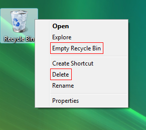
I would have thought that using "Remove Recycle Bin" or even "Delete Recycle Bin" rather than "Delete" would have been a better option.
I guess that MS didn't pass round the "Don't make me think" book.
why people delete the recycle bin
I would have thought that using "Remove Recycle Bin" or even "Delete Recycle Bin" rather than "Delete" would have been a better option.
I guess that MS didn't pass round the "Don't make me think" book.
Thursday, May 29, 2008
SnTT: Lotus Notes and Web UI Examples
Patrick asked for some Notes UI examples, so I thought that I'd post a couple of mine in the interest of additional food for thought - and also to let Chris and that other chap (the one with the funny colored hair!) that their mission was maybe a little effective.
I'll explain how I ended up with each UI. First of all I'm not a graphic designer and would never claim to be one. I'm pretty familiar with Photoshop and Gimp and if I'm given a starting point then I can come up with a few similar concepts.
The inspiration for my latest UIs are from the web 2.0 styles and web 2.0 applications. I love the simplicity of the interfaces like basecamp, ideaJam, Remember the milk and linkedin. These application have the less-is-more approach to making the interfaces simple. This is what I was striving for. A simple interface that is closer to what you see on the web than the traditional notes applications.
I've still retained the traditional frames approach, but removing the borders made the first page more web like. The horizontal outline in black, for the primary navigation is something that you might see on a website.

On the form the removal of the traditional border around the action bar is removed and shaded so that the action button feels more like it is part of the page. (I think that I picked up that tip from someone else, although I can't remember who)
 The downside of the tabbed approach is that printing format isn't that great, but the client rarely prints so its not much of an issue.
Finally a web example, this is a Lotus Domino web application. The process that this manages is a 6 step process with sub task for each one.
I started by drawing a low fidelity prototype which laid out what I wanted to convey and where to put it. For example, the status of the top level steps and status bar for the sub steps. I then engaged a local graphic designer to come up with the images, colors and general look and feel.

With these examples I think that I got a closer to what I was striving for and embraced some of the things that Chris and Nathan endorse. Starting with a blank piece of paper and working out what am I'm trying to tell the user was a good technique for me to detach from the technology and focus on the interface without considering how to implement it. For web applications this works well. For Notes applications, there's no harm in starting with the vision and then re-factoring the paper interface by accepting compromises as you work out the detail.
Finally try de-cluttering the interface. You might have elements of your design that have been inherited from application to application and just accepted as required.
I've seen heaps of LN applications that have the old classic 5 entry audit history tagged at the bottom of every form. Do forms with pick list values for dblookups really require an audit history ? If not then get rid of them as they are not only cluttering the interface but you are also storing and managing irrelevant information.
There you go Patrick, a few additional Lotus Notes and Domino UI examples.
Subscribe to:
Comments (Atom)