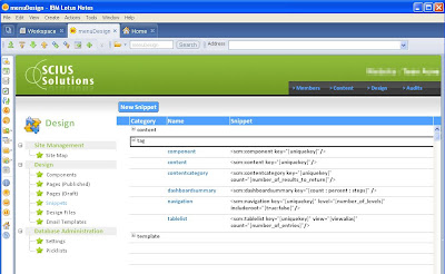
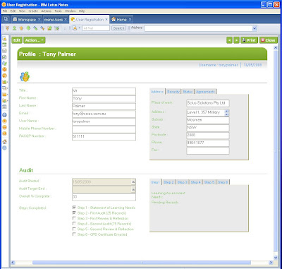
Patrick asked for some Notes UI examples, so I thought that I'd post a couple of mine in the interest of additional food for thought - and also to let Chris and that other chap (the one with the funny colored hair!) that their mission was maybe a little effective.
I'll explain how I ended up with each UI. First of all I'm not a graphic designer and would never claim to be one. I'm pretty familiar with Photoshop and Gimp and if I'm given a starting point then I can come up with a few similar concepts.
The inspiration for my latest UIs are from the web 2.0 styles and web 2.0 applications. I love the simplicity of the interfaces like basecamp, ideaJam, Remember the milk and linkedin. These application have the less-is-more approach to making the interfaces simple. This is what I was striving for. A simple interface that is closer to what you see on the web than the traditional notes applications.
I've still retained the traditional frames approach, but removing the borders made the first page more web like. The horizontal outline in black, for the primary navigation is something that you might see on a website.

On the form the removal of the traditional border around the action bar is removed and shaded so that the action button feels more like it is part of the page. (I think that I picked up that tip from someone else, although I can't remember who)
 The downside of the tabbed approach is that printing format isn't that great, but the client rarely prints so its not much of an issue.
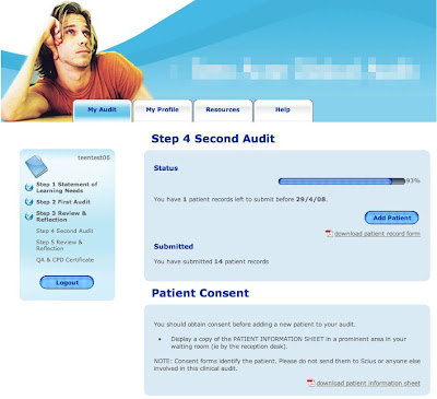
Finally a web example, this is a Lotus Domino web application. The process that this manages is a 6 step process with sub task for each one.
I started by drawing a low fidelity prototype which laid out what I wanted to convey and where to put it. For example, the status of the top level steps and status bar for the sub steps. I then engaged a local graphic designer to come up with the images, colors and general look and feel.

With these examples I think that I got a closer to what I was striving for and embraced some of the things that Chris and Nathan endorse. Starting with a blank piece of paper and working out what am I'm trying to tell the user was a good technique for me to detach from the technology and focus on the interface without considering how to implement it. For web applications this works well. For Notes applications, there's no harm in starting with the vision and then re-factoring the paper interface by accepting compromises as you work out the detail.
Finally try de-cluttering the interface. You might have elements of your design that have been inherited from application to application and just accepted as required.
I've seen heaps of LN applications that have the old classic 5 entry audit history tagged at the bottom of every form. Do forms with pick list values for dblookups really require an audit history ? If not then get rid of them as they are not only cluttering the interface but you are also storing and managing irrelevant information.
There you go Patrick, a few additional Lotus Notes and Domino UI examples.
Nice work. I particularly like the LACK of graphics saturation.
ReplyDeleteNice use of right-alignment on the action bar, too.
Find me on Bleedyellow Sametime to discuss techniques to eliminate the horizontal scrollbar I see on that form. :-)
Tony,
ReplyDeleteThank you for the kind words about IdeaJam. We have learned a lot about UI from this little project. In fact LinkJam which will soon go beta has some new features that will make their way back to IdeaJam. Thanks again for the shout out.
Tony, these look awesome! Any chance you'll be able to share some code?
ReplyDelete@Nate/@Bruce, thanks for the comments.
ReplyDelete@Kevin - yes I intend to share the code. I'm planing on using the same UI for the dojo samples database (that I talked about before). It will most likely be a few months away.
Hi Tony...I'll echo the other comments here and say very nice work! I like the removal of the frame borders, which is something I do also to more effectively manage whitespace. The layout is very simple and clean, which is prized by end users more than most people know. Thanks for sharing!
ReplyDeleteHej Thanks you for sharing! I guess these are the type of examples I was asking for, for they look good and are expiring.
ReplyDeleteIt would be nice if more people would share their creations for great UI design for the Notes client =)
// Patrick
@Chris, Thanks for the great feedback. It's very encouraging to get this feedback from the yourself and Nate.
ReplyDelete@Patrick, Thanks for the comments, I'm glad you liked the designs and hope that it is helpful. I was going to say its a shame that we don't have a CSSZengarden equivalent in the Notes world. However, In thinking about it, most of the inspiration for these designs didn't come from the Notes world but from the Web world. Still, it would be a nice idea to show case all the really good Notes UI examples out there.